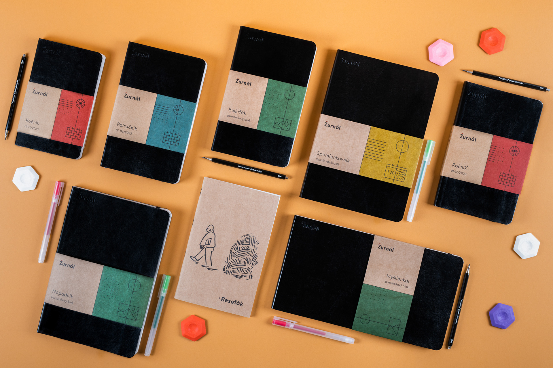
I decided to go more into abstract form rather than copy Moleskine and others manufacturers.
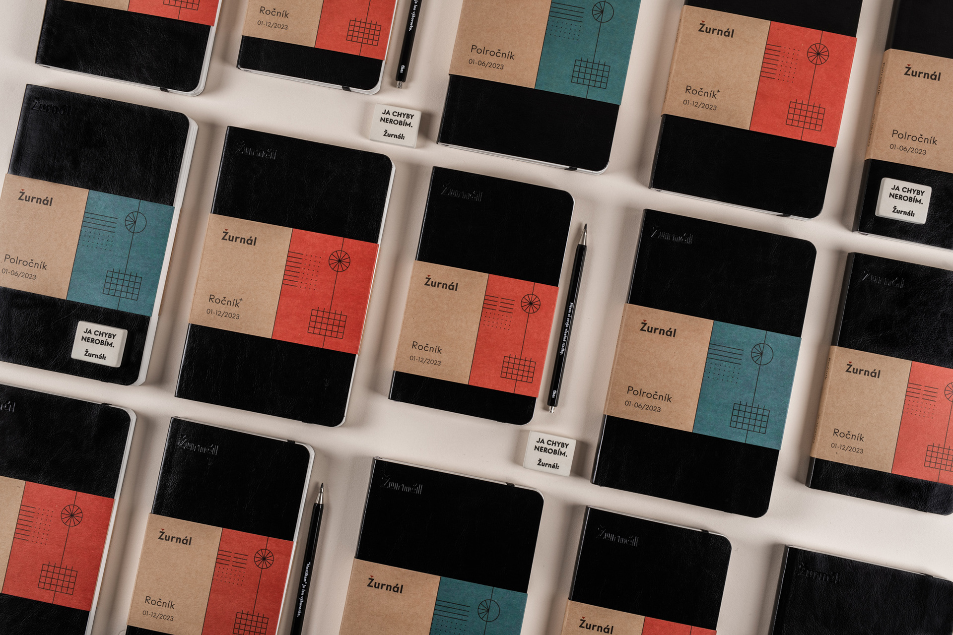
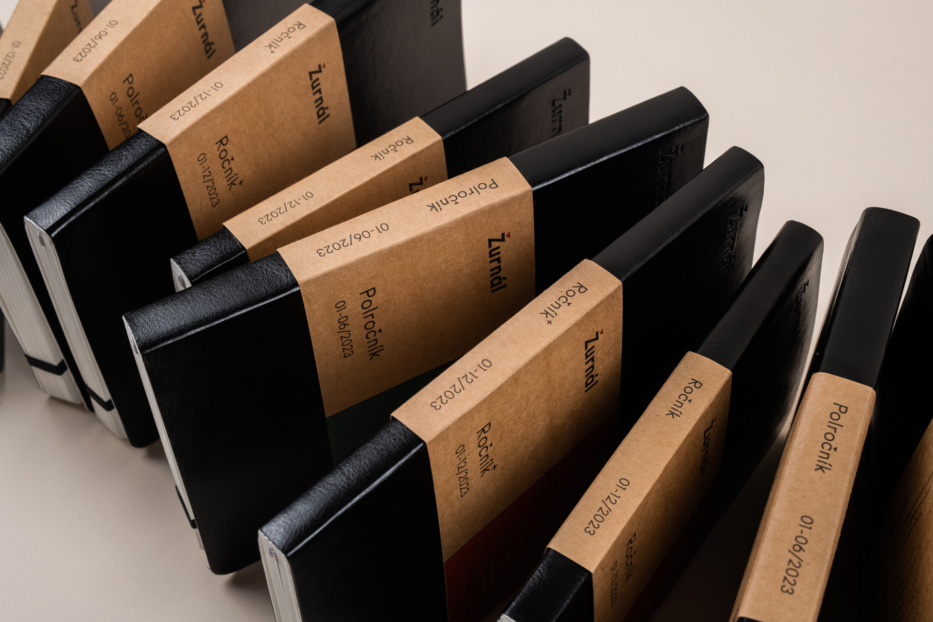
Common practice is to communicate literally the same verbal information about layouts, number of pages and other info right on the front side of packaging. That's a shame, because there usually isn't a lot of space.
These information are not crucial in the process of attracting attention so I put them on the back. The front side gained more air and I could play with colors and shapes. The result is unique combination of three graphic elements - layout, type (daily planner, empty notebook) and dating (year, half-year, no-dating).
With this approach, each product has its own combination while still being consistent with branding. Also I wanted encourage curiosity amongst users not providing them with every detail till they pick up the product and turn it around.